Graphical Analysis of Lab Data using Desmos
Talk given at the Spring Meeting of the Indiana Section of AAPT in April, 2022.
Abstract
In the past, I have asked students to construct graphs of lab data by hand or by using Microsoft Excel. For the past few semesters, I have been having students use the free online graphing calculator Desmos (www.desmos.com). It can perform linear and curve fits much more precisely than can be done by hand, but it is much friendlier to new users than Excel. Most importantly, I’ve found that students using Desmos spend less time constructing their graphs and more time using, analyzing, and describing them. I will share some Desmos’s features, some of my uses for the program, and some tips and tricks. I think this talk will especially appeal to teachers who use the modeling curriculum and teachers of non-Honors students.
Using Desmos in Labs
Plotting Data
Go to www.desmos.com/calculator to get started.
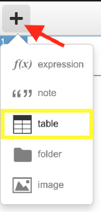
At the top left of ths screen, use the “+” sign and click “table” to begin plotting data.
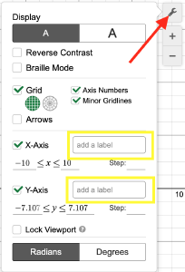
You can label axes by using the wrench icon in the top right of the graph.
Linear and Curve Fitting
You can perform lines of best fit by inserting an expression. You have to use ~ instead of =, and you have to make sure to refer to the names of the x and y values in the table (e.g. y1 and x1).
- Linear Fit Example (use
y1 ~ m x1 + b) - Quadratic Fit Example (use
y1 ~ a x1^2 + b x1 + c) - Arbitrary Fit Example (use
y1 ~ 2π sqrt( x1/g ))
Inserting into document
This is the most confusing part of the whole process. I usually have students start by exporting an image by clicking the share logo in the top right bar on the screen.
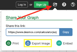
Then, they need to right-click the image and click “Copy.” They can then paste into their document.
I also have them copy and pasty the sharing link into their document. That way, if they need to access their graph later and update it, they don’t have to start from scratch.
Sample Labs
- Ball Bounce Measurement (introductory): Template (.docx), Sample Student Data (.docx)
- Constant Velocity Cars: Template (.docx)
- Period of a Spring: Template, Sample Student Data (.docx)